top of page
Search
Writer's pictureEmily

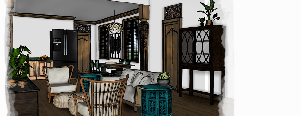
Well, We finally reached the end of our largest project yet! This Project has been by far our most challenging one yet. Designing a mixed-use building was fascinating. Considering materials that were commercial grade yet appropriate for residential use as well was a particular challenge. Luckily we had time to discover and introduce ourselves to some really amazing companies that have made commercial grade materials that are actually gorgeous!

My biggest challenge was getting out of my safety zone. Allowing myself to think less linearly and more organically. I have discovered that curvilinear lines give me anxiety (when designing myself) but I actually am drawn to them when I am experiencing a building for myself. I am going to challenge myself to use more organic and curvilinear lines in future projects. I also hope to explore spot rendering further as well. Traditionally spot rendering is well....spots, but I decided to mimic the pattern in Tenang's logo for my final spot rendering. The shapes actually worked out quite well, allowing me to showcase all of the different materials and flooring. The process was a little irksome as the easiest way to accomplish a linear spot rendering is to color render the entire floor plan and then erase...that was fun...


In the end this project helped me think outside the box as a designer, familiarized me with companies and manufacturers I hadn't been introduced to yet, forced me to consider design for many different people with many different abilities, and expanded rendering and space planning skills. I look forward to seeing the entries for the competition and how different minds created unique designs.


Cheers!


17 views0 comments
Writer's pictureEmily

A couple weeks into our Fall semester and things are humming along. I have just finished polishing up the floor plan and will be moving on to picking out the FF&E next. There are still things to tweak here and there but we are getting close!


The floor plan for the resort has been like piecing together a puzzle. We were given the exterior walls, windows, and doors (which cannot be moved) and were given specific square footage and dimensions for certain rooms in the interior. It was wonderfully challenging to arrange the space so everything lined up correctly with the windows and columns, was accessible, and flowed naturally. I found my design having to change quite drastically all because of one window. It was a great lesson on allowing yourself to be flexible and really looking at a space as a puzzle.


15 views0 comments
Writer's pictureEmily

After what seemed like the shortest summer break in history, I am now back in class and ready to get things rolling! This semester we will be spending most of our time working on the Bienenstock Furniture Library Interior Design competition. This project will be a combination of residential and commercial design. We will be designing a medical spa for M.S. patients that sits at the bottom of a mountain in our chosen location. While I was initially jealous of previous competition themes (stadium suites with music themes and art museums) this project has grown on me. I am enjoying learning how interior design can impact the physical and mental well-being of people suffering from a serious illness. It has been fascinating considering how color effects mood, how contrast helps with deteriorating eyesight, or how busy patterns can over-stimulate. There is so much to consider beyond the usual accessibility codes, and I look forward to the challenge.

So far I have decided my Medical Spa will be located in Bali, where it is rich with ancient natural therapies and allows for complete tranquility, which is where the name Tenang (tranquil in Balinese) comes into play. We have come up with logos and rough concept statements so far, and begin bubble diagrams and space planning next week.


13 views0 comments
bottom of page